Thursday, May 9, 2019
NFL’s Logos of Yesteryear (Part 1)
All of these logos are courtesy of the inimitable SportsLogos.net, run by Chris Creamer. He's the foremost authority on sports logos. Check him out.
Buffalo Bills, 1961
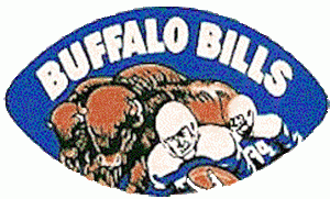
I'm sure the intention was to make the players seem like part of a buffalo herd, but this just makes it look like they're running from buffaloes. And they're gonna have to run fast. Buffaloes'll gitcha.
Buffalo Bills alternate, 1965-1969

No, dude, you can't just shove a buffalo away. Man, these dudes just doesn't have enough respect for the animals the purportedly represent.
Carolina Panthers alternate, 1995-2011

This looks less like a football team's logo and more like a failed metal band's logo. Even though all of the members got tattoos of this. Well, except Rick, who said some BS about no tattoos at his job. Your shirt will cover it! You wear a shirt to work, right Rick?
Cincinnati Bengals, 1968-1969

In an alternate universe, tigers do play football. And have a team called "the humans." The logo is, yes, a running human whose helmet, bearing the same human's head, pops off.
Cleveland Browns alternate, 2003-2014

I'm not saying put it on the helmet, but why oh why was this not the primary logo, and why has it been discontinued? In a world of bulldog logos, this is the best one by a mile.
Dallas Cowboys, 1966-1969 alternate

That poor horse, having to bear a human bigger than he is. Also, how is this good enough art to be commissioned for logo use? I know cartoony logos were big in the '60s and '70s, but this is poor by any standard.
Denver Broncos, 1960-1961

More horse abuse from giant humans, and this one is awful cavalier about it. It just seems foolhardy to use a toothpick while on a bucking horse, but to be fair, I haven't tried it. Also, note the better artwork, Cowboys.
Denver Broncos Alternate, 1997-present

This bronco does not look tough. This bronco looks like he's been spooked by a cat.
Detroit Lions, 1961-1969

This is fantastic. The Lions present logo, with its tweaks over the years, is also good, but there was no reason ever to change out this one.
Indianapolis Colts unused, 2001

I so wish they would've rolled this one out. I would've called it "Peyote Ugly" on Twitter and got 5,000 likes.
Kansas City Chiefs, 1963-1969
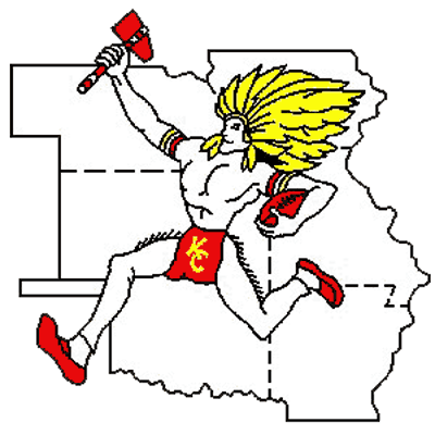
I read somewhere that teams like the California Angels and the Florida Marlins names themselves thusly to appeal to a broader geographic base. I really like how this logo takes that philosophy to its logical conclusion.
Miami Dolphins, 1974-1979

I don't think this logo, or its different slight iterations over the years before their more dramatic change in 2013, is particularly bad or particularly good. But I do have two things to say about it: 1) It's interesting that this level of detail is so very out of fashion now in sports logos. 2) As a kid doodling logos, I didn't realize that was a sun. I thought it was a hoop the dolphin was jumping through. It was more clearly a hoop when I'd draw it from misremembered memory.